Table of Contents
ToggleTechnologies are rapidly changing how users interact with mobile apps. As innovations come out, they directly impact the mobile app development process, requiring mobile app developers to adapt their approach based on evolving device capabilities. One of the most significant advancements in recent years is the rise of foldable devices, which are at the forefront of this mobile revolution.
If you are running an existing mobile app and want to expand to foldable platforms, or if you are a mobile app developer thinking about how to optimize mobile apps for foldable devices, this blog is for you.
This is your complete foldable phone developer guide, covering everything from foldable device app development and adaptive UI strategies to multi-screen app optimization and performance tips.
So let’s start understanding how to future-proof your mobile app for foldable devices!
What are foldable devices?
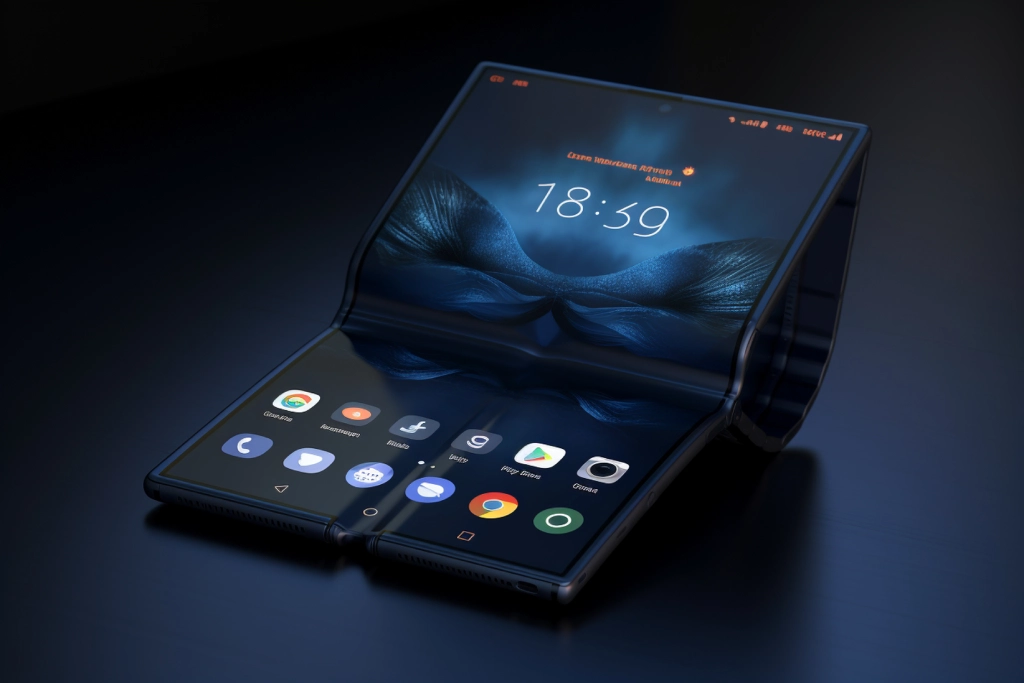
Foldable devices are smartphones or tablets with flexible screens that can fold inward or outward, allowing them to switch between compact and expanded screen sizes. These devices offer increase multitasking, dual-screen functionality, and a more immersive user experience.
Popular examples include the Samsung Galaxy Z Fold, Google Pixel Fold, and Microsoft Surface Duo. They challenge traditional UI/UX design, requiring adaptive layouts and responsive mobile app development.

Understanding foldable device types and display modes
Foldable devices are categorized based on their hinge orientation, number of screens, and screen state transitions.
Below is the table that provides you a foldable device types with examples:
| Foldable Type | Example Device | Description |
|---|---|---|
| Single Fold (Inward) | Samsung Galaxy Z Fold | Unfolds from phone size to tablet size |
| Clamshell Fold (Outward) | Samsung Z Flip | Compact fold, vertical orientation |
| Dual-Screen | Microsoft Surface Duo | Two screens connected via a hinge |
| Flexible Display | Huawei Mate X | One continuous display that folds outward |
Key challenges in foldable device app development
Developing a mobile app for foldable devices goes beyond responsive design because it involves handling screen transitions, multi-window use, and ensuring consistent performance across different postures.
Here are the key challenges mobile app developers face:
1. Dynamic screen sizes and aspect ratios: Foldable devices switch between phone-sized and tablet-sized displays, resulting in changing aspect ratios and resolutions. Mobile app developers must implement flexible and responsive UI for foldable smartphone components that resize and reflow smoothly without distorting content or breaking layouts.
2. Multi-window and split-screen scenarios: Foldables encourage multitasking, allowing users to run multiple mobile apps side by side. This makes multi-window app optimization essential, as mobile app developers must ensure their apps function smoothly within constrained screen spaces.
At the same time, multi-screen app optimization becomes important to handle different layouts across dual displays, ensuring the mobile app adapts easily, manages focus changes gracefully, and avoids performance drops.
3. Dual-screen and hinge awareness: Some foldable devices, like the Microsoft Surface Duo, feature dual displays with a hinge in the middle. To support proper dual-screen app functionality, developers need to make apps hinge-aware and avoid placing critical UI elements (like buttons or text) in the hinge zone, ensuring better usability and user experience across both screens.
4. App continuity during transitions: A major UX challenge is maintaining app continuity when the device folds or unfolds. Without proper state management, users may lose input data, scroll positions, or even face app restarts—leading to a frustrating experience.
5. Testing across multiple device configurations: App testing for foldable devices is more complex due to the variety of fold types, screen sizes, and postures.
Mobile app developers need to simulate different scenarios using emulators, physical devices, and tools like Jetpack WindowManager to catch potential UI or performance issues early.
Android foldable screen support
To support the growing foldable ecosystem, Google introduced Android 12L—a version of Android specifically for large-screen and foldable devices. It includes:
- Improve UI elements like taskbars, improved multitasking support, and resizable app windows.
- New APIs through Jetpack WindowManager, allow developers to detect fold posture, hinge orientation, and device layout in real-time.
- Optimized resource management that ensures mobile apps remain performant even when displayed in multi-window or split-screen environments.
By using Android 12L for large-screen features, mobile app developers can create mobile apps that deliver smooth experiences across a wide range of foldable and tablet devices.
Best practices for foldable UI and UX design
Creating a smooth user experience on foldables involves thinking beyond standard mobile design. Mobile app developers must focus on building adaptable interfaces that scale and reflow naturally across various fold states and screen orientations.
Foldable screen UI design tips:
- Avoid absolute positioning: You can use constraint-based layouts. Absolute positioning often breaks when screen dimensions change. Instead, ConstraintLayout in XML or Jetpack Compose’s constraint system allows UI elements to respond fluidly to different screen states and sizes.
- Keep key actions away from the hinge: The hinge or fold line can visually split the UI, making touch interaction difficult near the fold. Mobile app developers need to keep call-to-actions (CTAs), navigation buttons, or essential content away from the hinge area to maintain accessibility.
- Use responsive containers: You can use tools like ConstraintLayout or Jetpack Compose’s BoxWithConstraints to allow components to adjust their size and alignment based on the available screen space, helping you create responsive apps for foldable screens that look great whether the device is folded or unfolded.
| Best Practices for Foldable UI | Why It Matters |
|---|---|
| Use fluid layouts (ConstraintLayout) | Adapts automatically to screen changes |
| Detect posture using Jetpack WindowManager | Helps adjust UI for folded or tabletop mode |
| Support drag-and-drop between screens | Boosts productivity and user satisfaction |
Optimizing UX for foldable devices:
- Use two-pane layouts effectively: Taking advantage of the larger screen real estate improves productivity. For example, in an email app, the list of messages can appear on the left, and the selected message content on the right, increasing usability and reducing navigation steps.
- Consider fold-aware navigation: Fold-aware design ensures that navigation menus, sliders, and controls are placed logically around the hinge, not through it. This results in better dual-screen app functionality and a cleaner visual experience.
- Add smooth screen transition animations: Screen transitions in foldable between folded and unfolded states should feel natural. You can use MotionLayout or Jetpack Compose animations to help users stay engaged and informed during screen mode changes, improving UX on foldable devices significantly.

Also Read: Best Trending Apps by Industry: What’s Popular Right Now?
Adaptive app design for foldable screens
Adaptive layouts are essential to optimize apps for foldable phones, as mobile apps must adjust in real time based on screen posture, orientation, and available space. Unlike traditional devices, foldables demand flexible UI behavior to maintain a consistent user experience.
Tools & Strategies:
- Jetpack WindowManager: This will help to detect fold state, hinge angle, and device posture so your mobile app can adapt instantly to changes in screen configuration.
- SlidingPaneLayout: This is ideal for building two-pane layouts that automatically adjust based on screen size, perfect for unfolded or dual-screen modes.
- Responsive apps for foldable screens: The mobile app developer should use auto-scaling fonts, flexible image containers, and edge-to-edge UI to ensure a clean and adaptable design across all screen modes.
Code Snippet:
| val windowInfoTracker = WindowInfoTracker.getOrCreate(context) windowInfoTracker.windowLayoutInfo(this) .onEach { layoutInfo -> // Adjust layout based on folding feature } |
Multi-screen and multi-window optimization
With foldable, mobile apps often run in multi-window or split-screen mode, where users interact with multiple mobile apps or multiple instances of the same mobile app at once. Optimizing for these scenarios increases usability and keeps your mobile app competitive.
Multi-window app optimization tips
To support multi-window app optimization on foldable devices, set resizeableActivity=true in the manifest to allow proper behavior in split-screen mode. You can use modular components like fragments or Jetpack Compose composables to ensure the UI adjusts smoothly across different layouts.
Also, manage separate states for each instance of the mobile app to avoid data loss, especially on devices with dual-screen app functionality.

Split-screen app performance
Mobile apps should load quickly in split view and respond to changes in real time. Developers can use lightweight components and avoid large memory-heavy processes on startup.
You need to prioritize lazy loading techniques, background threading, and view recycling to maintain smooth mobile app performance even when running in constrained screen areas.
App continuity and smooth transitions
One of the biggest UX issues on foldable devices is when mobile apps reset during folding or unfolding. To ensure smooth mobile app continuity, mobile app developers should handle lifecycle events properly.
You can use onConfigurationChanged() to manage UI changes manually, and ViewModel to retain data like scroll positions or form inputs during transitions.
This helps maintain a smooth user experience across different screen states.
| override fun onConfigurationChanged(newConfig: Configuration) { super.onConfigurationChanged(newConfig) // Recalculate layout and UI logic } |
Screen transitions in foldable
Transitions should be smooth to ensure a consistent user experience. You can use MotionLayout or Navigation Components to create clean animations during fold/unfold events. This helps reduce visual disruption and keeps the mobile app feeling fluid and responsive.
Testing and debugging apps for foldable devices
Testing is essential to ensure your mobile app works across different screen modes and orientations. You can use tools to simulate transitions and catch layout issues early.
App testing for foldable devices: Tools to use
| Tool | Purpose |
|---|---|
| Android Emulator (Foldable) | Simulate fold, unfold, and posture changes |
| Samsung Remote Test Lab | Real-device testing in the cloud |
| Firebase Test Lab | Automated multi-device testing |
You can use Jetpack’s WindowLayoutInfo to simulate posture changes and debug UI behavior.
Flexible display app development tools and libraries
| Tool / SDK | Purpose / Use Case |
|---|---|
| Jetpack Compose | Build responsive and adaptive UIs with less code and modern UI components. |
| WindowManager | Detect fold posture, hinge position, and screen layout to adjust UI dynamically. |
| SlidingPaneLayout | Create dual-pane layouts, ideal for master-detail interfaces on larger screens. |
| Samsung Foldables SDK | Offers APIs and tools tailored for Samsung foldable devices and advanced UX support. |
| Microsoft Surface Duo SDK | Provides dual-screen APIs, hinge detection, and layout controls for Surface Duo apps. |

Also Read: A Complete Guide to Hiring the Best Mobile App Developer
How AlphaKlick Solution can help optimize foldable apps?
If you are looking for expert support in foldable phone UI design, AlphaKlick Solution, a leading mobile app development company in India, offers proven experience in adaptive mobile design and mobile app development.
We specialize in Android foldable app development, adaptive layouts for foldable phones, and multi-screen app optimization, ensuring your mobile app delivers a smooth experience across all foldable devices.
Whether you are building a new mobile app or optimizing an existing one, our development team provides end-to-end guidance from strategy and design to development and testing. With the latest tools and technologies, we ensure your mobile app is responsive, high-performing, and fully compatible with dual-screen and foldable environments.


